Institut für Kulturelle Teilhabeforschung
Style Guide
Created to get a simple overview of the design elements. This is intended to achieve a consistency of the external effect and thus security for the user, through a strong identity.
The Logo
The logo system can be used two ways. 1. As a standalone logo and 2. As a typgraphic component in a layout with dynamic spaces and content. Simply speaking this means that the logo can be combinated in a more flexible way. See examples bellow.
Minimum Protection Space to next elements in Layout
10px X 10px Grid in use
1. As a standalone logo
As a standalone logo, both the IKTf acronym and full name are shown. This can be a single line or two-line version.
1.1 Standalone logo – One line
Example – businesscard, back
1.2. Standalone Logo: Tow lines
Example – no example yet
1.3. Standalone Logo: Acronym
Occaisonally the IKTf acronym can be shown alone when space is limited, for example on one side of a business card.
Download This Logo as .SVG
Example – Businesscard, front

2. As a typographic component in a layout with dynamic spaces
As a typographic element on the page, the IKTf acronym is shown alongside the main title, on the same baseline, in the same font, often in the top-right corner. The logo then becomes part of that particular visual layout’s typographic system. The full name ‘Institut für Kulturelle Teilhabeforschung’ is shown elsewhere at a different size in the same layout, often in the footer.
2.1. Logo with flexible space / left aligned
2.2. Logo with flexible space / right aligned
2.3. Acronym with flexible space and content / right aligned
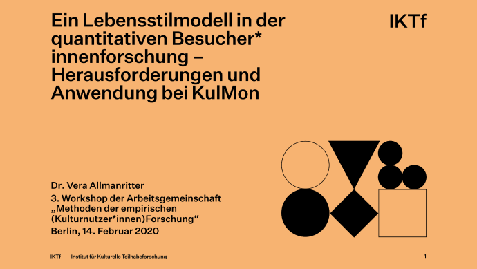
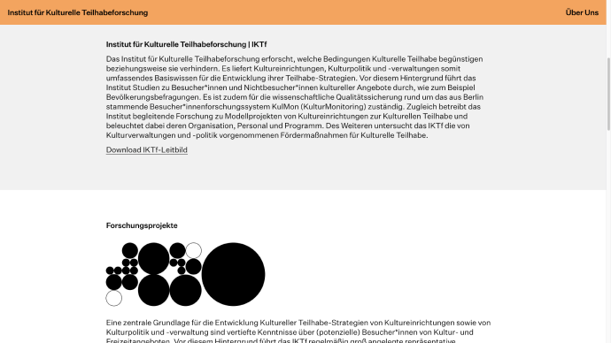
Flexible content means that only one part is the acronym or logotype (2.4). The other part is a headline or menu point. Building an typographic system.
Example: Powerpoint Template
2.4. Logotype with flexible space and content / right aligned
Example: Powerpoint temporary website
Typography
We use two typefaces in different cuts. As main typeface we use “Untitled” a workhorse for everything concerning content. Second “IBM Plex Mono” for descriptive fuunctionality in buttons, footnotes etc. Typesizes displayed here refer to sizes on web applications
Untitled Sans
Why Two Volcanoes in Hawaii Are So Close, but So Different
The New Threat to Wolves in and Around Yellowstone
No Bones About It: Scientists Recover Ancient DNA From Cave Dirt
This Is a Giant Shipworm. You May Wish It Had Stayed In Its Tube.
Jimmy Kimmel Sheds Light on Health Coverage for Infants With Birth Defects
Hitting a Medical Wall, and Turning to Unproven Treatments
Lorem, ipsum dolor sit amet consectetur adipisicing elit. Et aliquam, dignissimos incidunt dolor nam, qui sed labore consequuntur ex quisquam fuga cumque sint sequi placeat facere eos vel dicta eius.
Lorem, ipsum dolor sit amet consectetur adipisicing elit. Et aliquam, dignissimos incidunt dolor nam, qui sed labore consequuntur ex quisquam fuga cumque sint sequi placeat facere eos vel dicta eius.
Odio, exercitationem architecto porro sunt temporibus velit distinctio voluptatum consequuntur nesciunt ullam, impedit quod libero nulla quisquam culpa autem. Qui fugiat deleniti voluptates accusantium, similique repudiandae tenetur iste cupiditate odit.
Qui corporis dolorum debitis tempora excepturi explicabo modi ut possimus aliquam ipsum quibusdam, odit quam eos corrupti iure cum illo veritatis nemo architecto harum inventore! Dolore laboriosam consectetur inventore voluptas.
Die Schrifgröße "Small" ist nur für kurze Texte und einem Paragraphhen gedacht. Lorem, ipsum dolor sit amet consectetur adipisicing elit. Et aliquam, dignissimos incidunt dolor nam, qui sed labore consequuntur ex quisquam fuga cumque sint sequi placeat facere eos vel dicta eius.
IBM Plex Mono
Colors
Some simple rules for using colors.
-
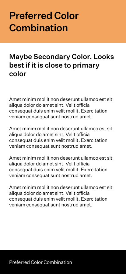
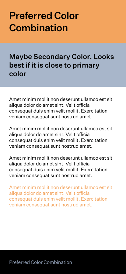
One page, one color. Don't use multiple colors on one page. Since we have some kind of color schemes. So the have to be unique.
-
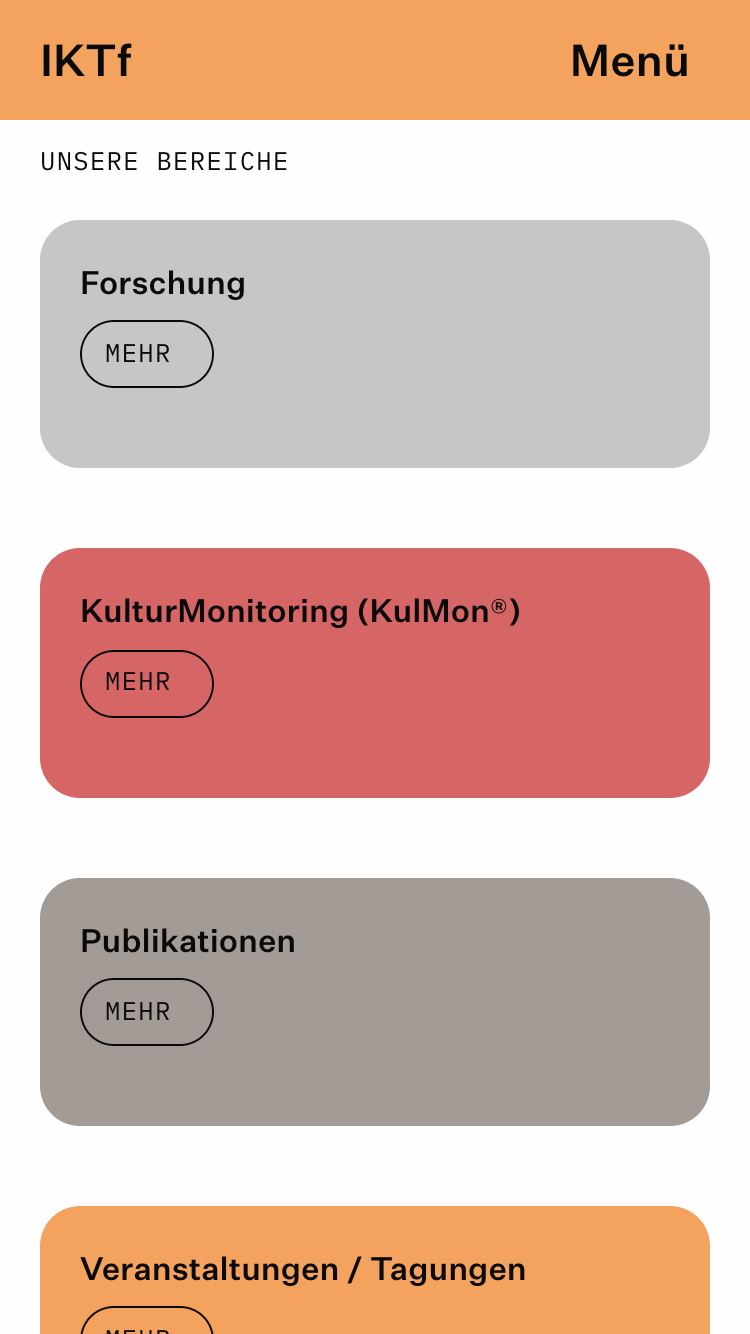
Of course if there are overview pages each page teaser has it's color.
-
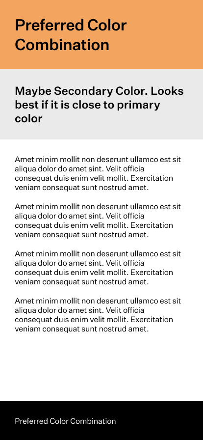
Gray / Color Combination might be possible.
-
Also light- dark- and default color combinations are possible. But default color always preferred.
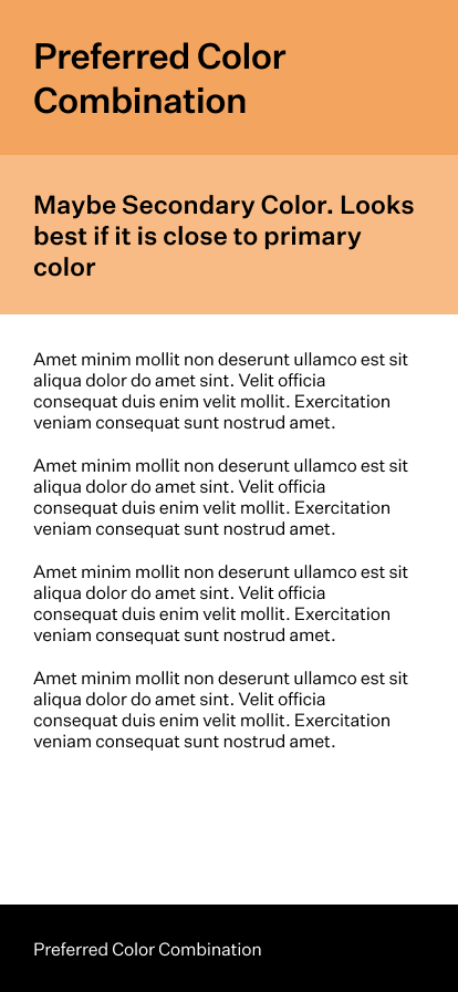
- Type is always black! No colored type please. On black backgrounds white is allowed.
* relates to proof from: 2.12.2020 PDF
Illustrations
We use basic shapes to create illustrations.
- Squares
- Triangles
- Circles
- White Space
The aim is to create a richer visual character for "richer" topics to give them more weight. We created a piece of software to generate those illustrations. This supports the scientific character. The generator can be found here: https://www.iktf.berlin/ggg/200/200/mixed/circle,rectangle,triangle/
You can adjust the settings by chaning the URL parameters:
https://iktf.berlin/ggg/[width]/[height]/[fillmode (fill, stroke, mixed)]/[possible shapes (triangle, square, circle, space)]/
Example: Illustration for a publication
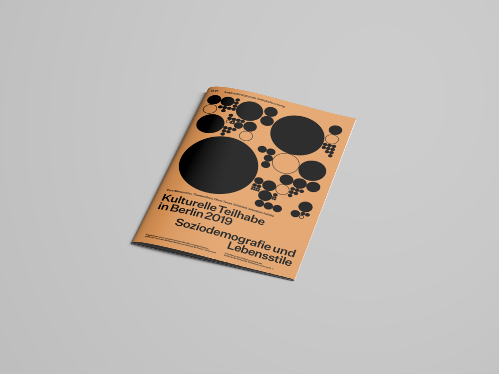
Examples and formats
Big illustration (homepage)
https://www.iktf.berlin/ggg/1400/400/mixed/circle,rectangle,triangle/
generates 1 Svg with the format 1400x400 with filled and unfilled, squares, triangles and circles.
Medium illustration (projects)
https://www.iktf.berlin/ggg/300/180/mixed/circle/
generates 1 Svg with the format 300x180 with filled and unfilled, circles.
Small Illustration (news, conferences…)
https://www.iktf.berlin/ggg/40/40/mixed/circle,triangle/
generates 1 Svg with the format 40x40 with filled and unfilled, circles and triangles.
Saving the Svg
Sorry this is a bit "complicated" but working.
Steps:
- Use chrome or any other browser to go to the generator.
- Generate the variation as you like by refreshing the page as often as you want.
-
Stop at the variation you like.
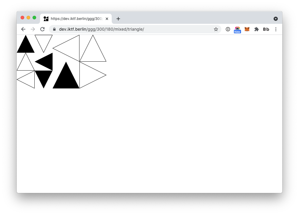
-
Display the source code
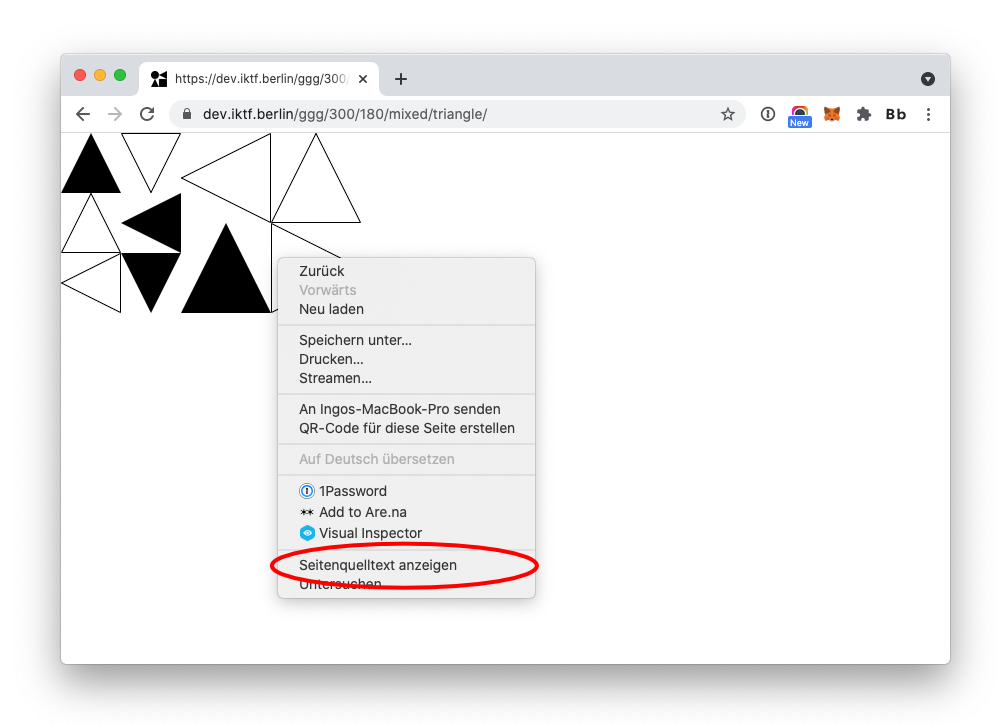
-
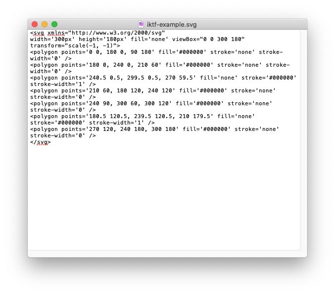
Copy the source code
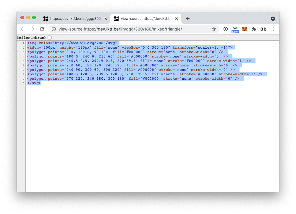
-
Paste the source code in a text editor and save as .svg
